Helping The Global Switchboard recreate its visual identity
About The Global Switchboard
The Global Switchboard is an organization committed to bridging local and global concerns in the Pittsburgh area. We focus on transforming the Pittsburgh region into a more globally engaged and equitable community, a place where all people value diversity, practice empathy, and work together to create a more just and peaceful world.
Source: www.theglobalswitchboard.org
The project
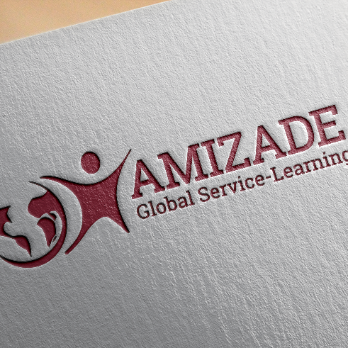
From the beginning, our intention was to completely eliminate the previous icon presented on the first logo. Because the Switchboard no longer had connections with Amizade, its previous project host, my goal was to embed Pittsburgh's vibe into the new design and add some strong, but also friendly typography to the new concept.
The confluence of Pittsburgh's three rivers is the driver to the new concept. I kept the old color palette as a way to reinforce the association with the organization, but all of the materials were adapted to give a new spirit.
My Role
Translate the creative brief to a brand new visual identity.
+ My Task in the Project
Graphic Design • Visual Identity
+ Collaborators
Creative Direction: Nathan Darity
The Global Switchboard's old logo.
Pittsburgh's three rivers. The city is a place where not only the rivers meet, but also people from different parts of the planet. This idea drove the entire rebranding project.
The typeface chosen for this project was Filson Soft, designed by Olivier Gourvat and made available by Adobe Fonts. Its rounded version provided a friendly look that both client and the designer wanted for the project.
With the rebranding module in place, it was time to disseminate it across the board. Here you see the business cards model created for the Switchboard staff.
Facebook cover page seen on Switchboard's main page.


